Every gallery wall tutorial says the same thing — pick a layout, keep the spacing even, stick to one frame color. Follow it exactly and you get a wall that looks fine, technically correct, and completely forgettable. The truth is most of what gets called gallery wall inspiration online is really the same twelve-frame grid recycled a thousand times with different photos inside it. These 13 ideas throw that formula out and build something people actually stop and look at. None of them need custom framing or anything hard to track down — every product below is something you can find and order on Amazon without digging through specialty shops.
Affiliate Disclosure: This article contains affiliate links which means we may earn a commission at no extra cost to you. You can check our affiliate disclosure page here.
What Actually Makes Gallery Wall Ideas Feel Original
Most walls fail to stand out because every element matches — same frame color, same spacing, same eye-level height. A wall that actually gets noticed usually breaks one of those rules on purpose, whether that’s letting the frames wrap around a corner, mixing in something that isn’t a frame at all, or hanging things at a height nobody expects. That’s the thread running through every idea below.
1. The Corner-Wrapping Wall
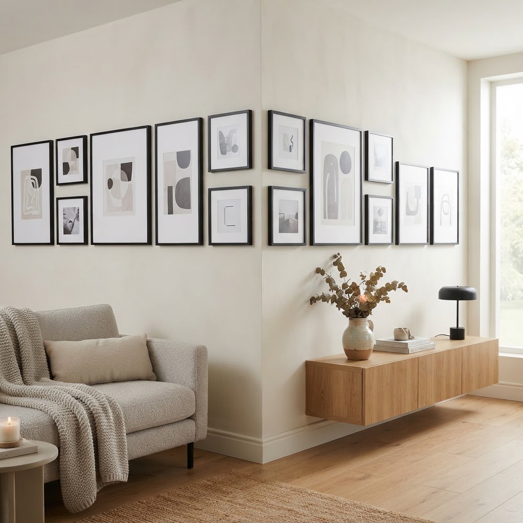
Instead of stopping your frames at the edge of a wall, let them turn the corner and continue onto the adjacent wall. Use a mix of matte black picture frames in a few different sizes, and keep the spacing consistent as the layout bends around the corner so it reads as one continuous piece rather than two separate walls. This single trick makes a room feel considered in a way a flat wall of frames never manages, since almost nobody thinks to treat a corner as part of the canvas.
2. The Ceiling-Crawl Gallery Wall
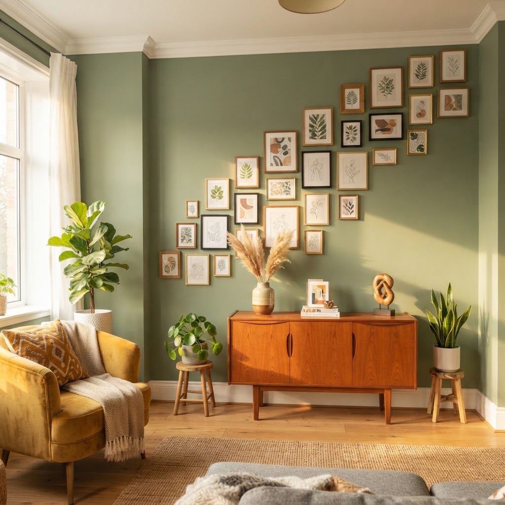
Most galleries stop a foot or two below the ceiling out of habit, not because it looks better. Let a few of your smaller mini picture frames climb right up to where the wall meets the ceiling, breaking the usual “eye level and below” rule completely. It draws the eye upward and makes the ceiling height feel more dramatic than it actually is, especially in a room with standard 8-foot ceilings that could use the illusion of more height.
3. The Sculptural Shelf and Frame Hybrid
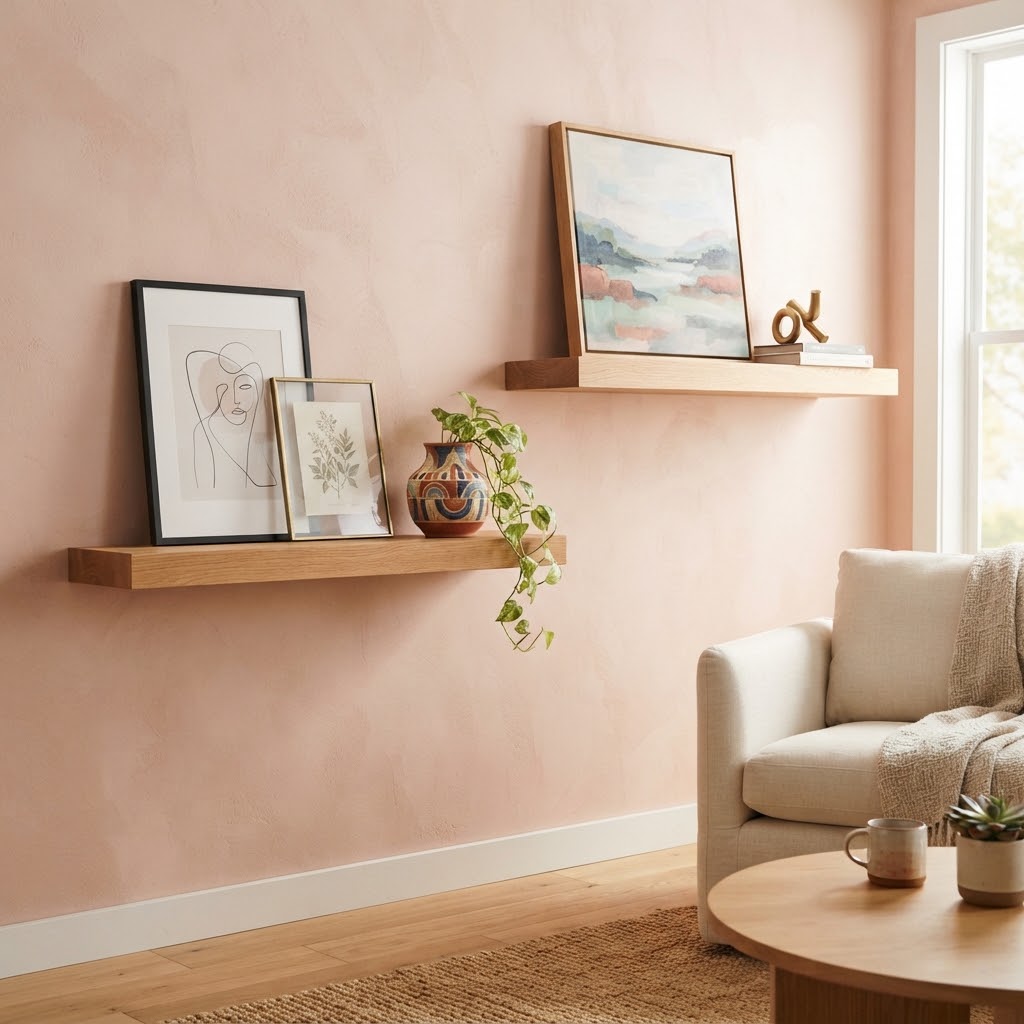
Skip an all-flat wall and mix in a couple of floating wood shelves at staggered heights between your frames. Lean a few pieces against the shelf instead of hanging everything flush to the wall, and add one small object — a vase, a small sculpture — on a shelf to break up the flatness. This hybrid approach gives the wall real depth, something a strictly flat gallery wall design can never fully achieve no matter how good the individual pieces are.
4. The Mirror-Frame Illusion Wall
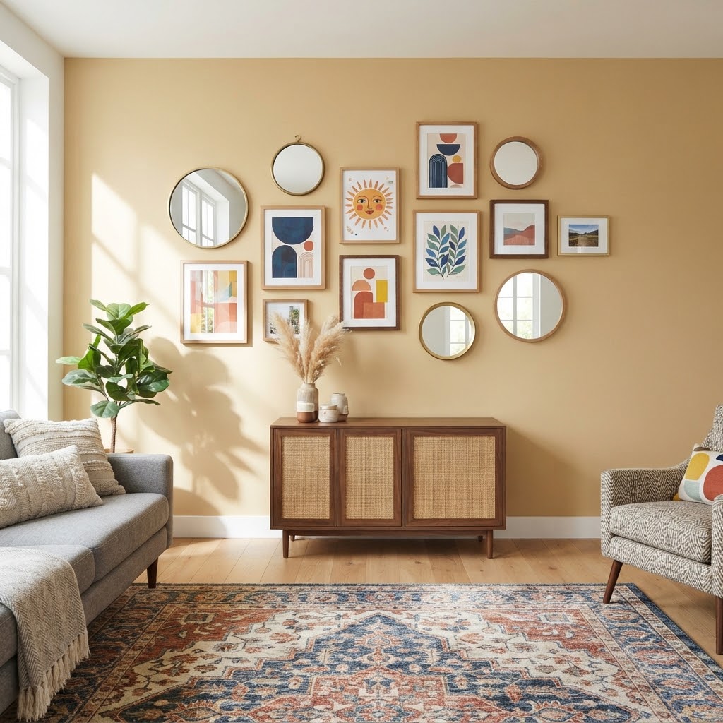
Instead of using one large mirror as a single statement piece, treat a handful of small round wall mirrors exactly like picture frames and mix them directly into your art layout. From a distance the wall reads as a normal gallery, but up close the mirrors catch light and reflect movement in a way flat art never does. It’s one of the more unexpected pieces of modern gallery wall inspiration because almost nobody thinks to fold mirrors directly into the layout instead of hanging them separately.
5. The Vertical Spine Wall Beside a Doorway
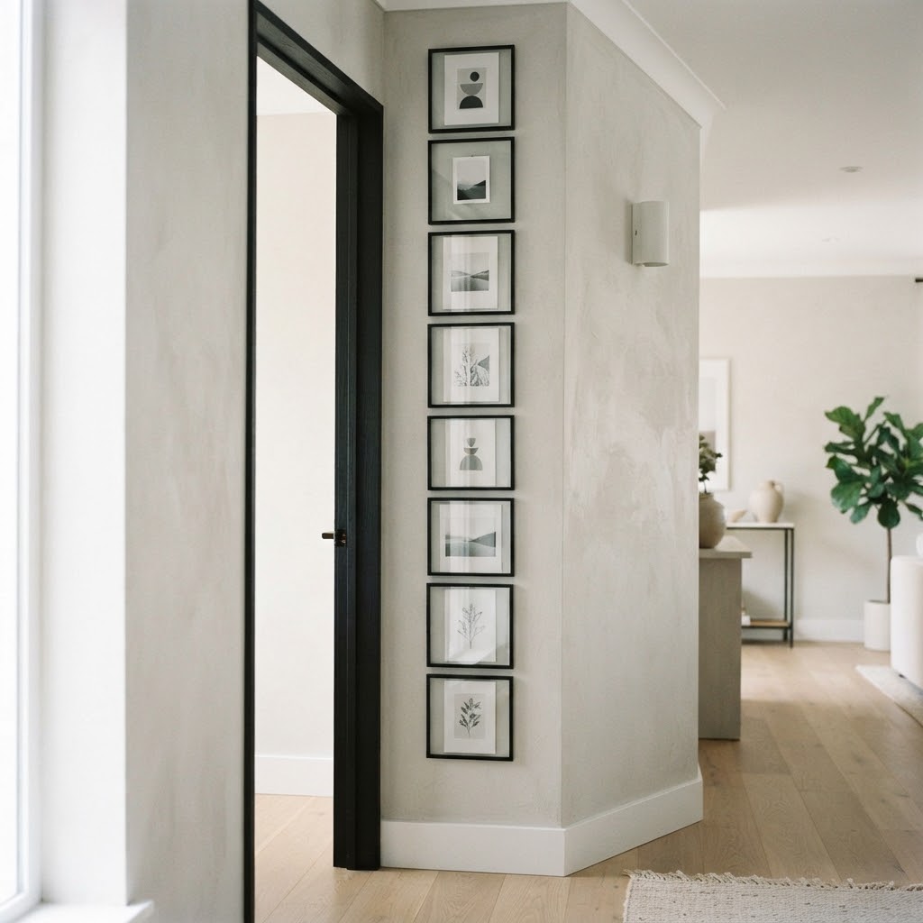
Rather than spreading frames wide across an open wall, run a narrow vertical column of slim picture frames stacked directly beside a doorway or entry point. It transforms an awkward strip of wall that’s usually left completely bare — too narrow for furniture, too small for a “real” gallery — into one of the most striking spots in the room. This is a genuinely underused piece of gallery wall design, since most people only consider big, open wall space and skip these narrow sections entirely.
6. The Woven Textile and Frame Mix
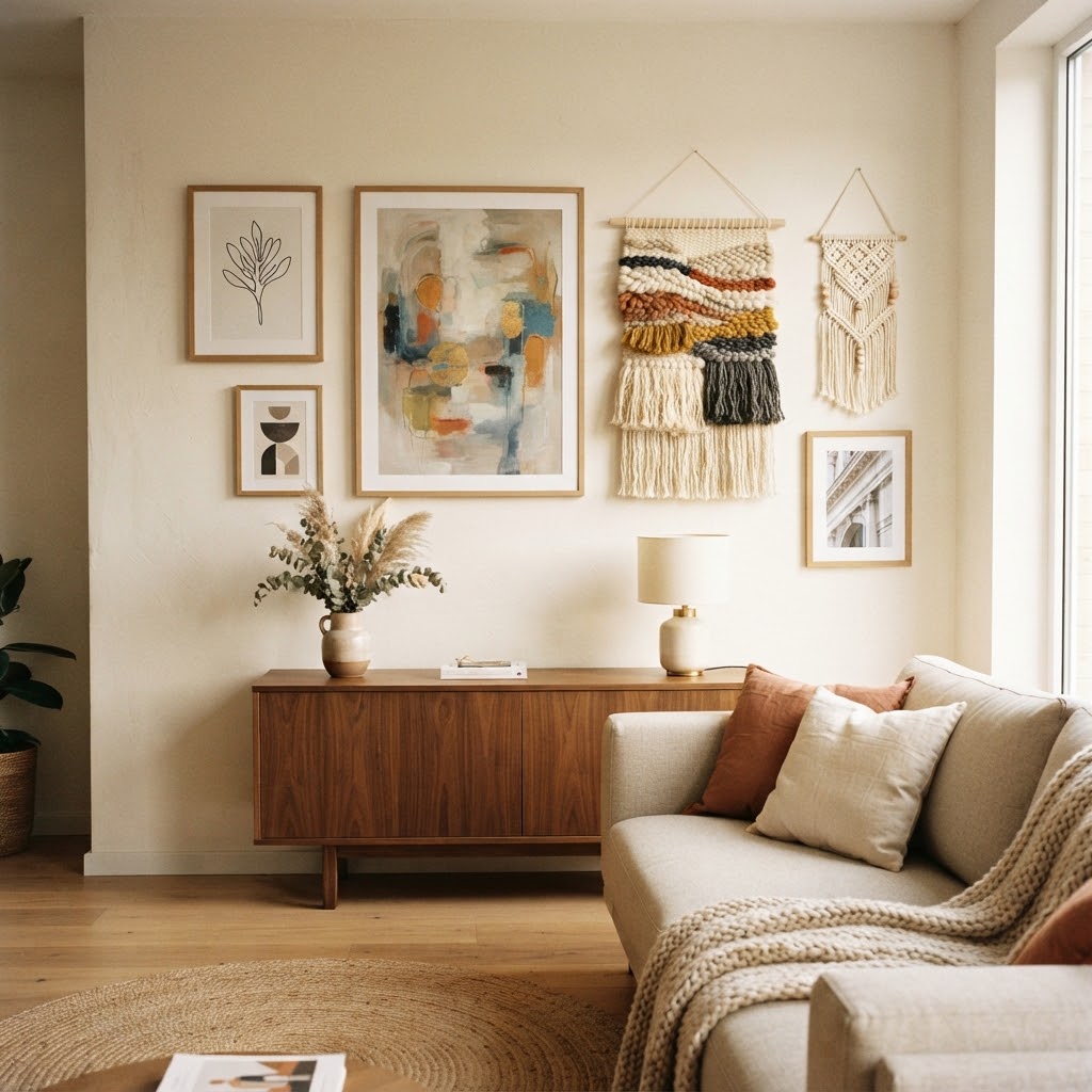
Break up an all-frame layout by weaving in one or two woven wall hangings alongside your art. The texture contrast between smooth glass frames and soft woven fiber gives the eye somewhere different to land, and it keeps the whole wall from reading as flat and one-note the way an all-frame layout inevitably does after a while. This mix is one of the easiest ways to make a gallery wall feel collected over time instead of bought in one single trip.
7. The Decorative Plate and Art Wall
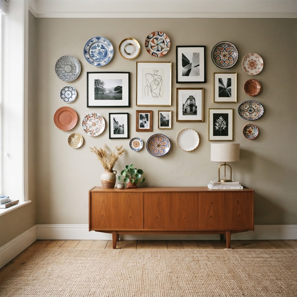
Hanging plates as wall decor has quietly become one of the more overlooked ways to build a genuinely original gallery wall. Mix a few decorative wall plates in with your regular frames instead of keeping them separate, letting the round shapes interrupt the usual rectangle-heavy grid. It reads as collected and a little unexpected, and it’s one of the rare living room gallery wall ideas that almost nobody actually attempts, despite how easy the plates themselves are to hang.
8. The Backlit Frame Centerpiece
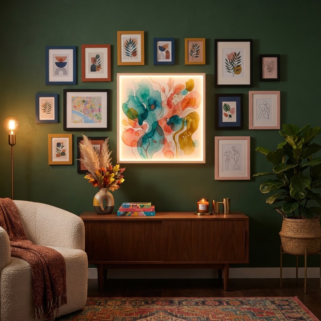
Instead of making every piece on the wall compete for attention, build the whole layout around one glowing centerpiece. A LED light frame, displaying a print, photo, or piece of art from behind, gives the wall an actual focal point that changes the mood of the room once it’s turned on at night. Surround it with a handful of smaller matte frames so the light box reads as the obvious star of the layout rather than getting lost among everything else.
9. The Suspended Picture Rail Wall
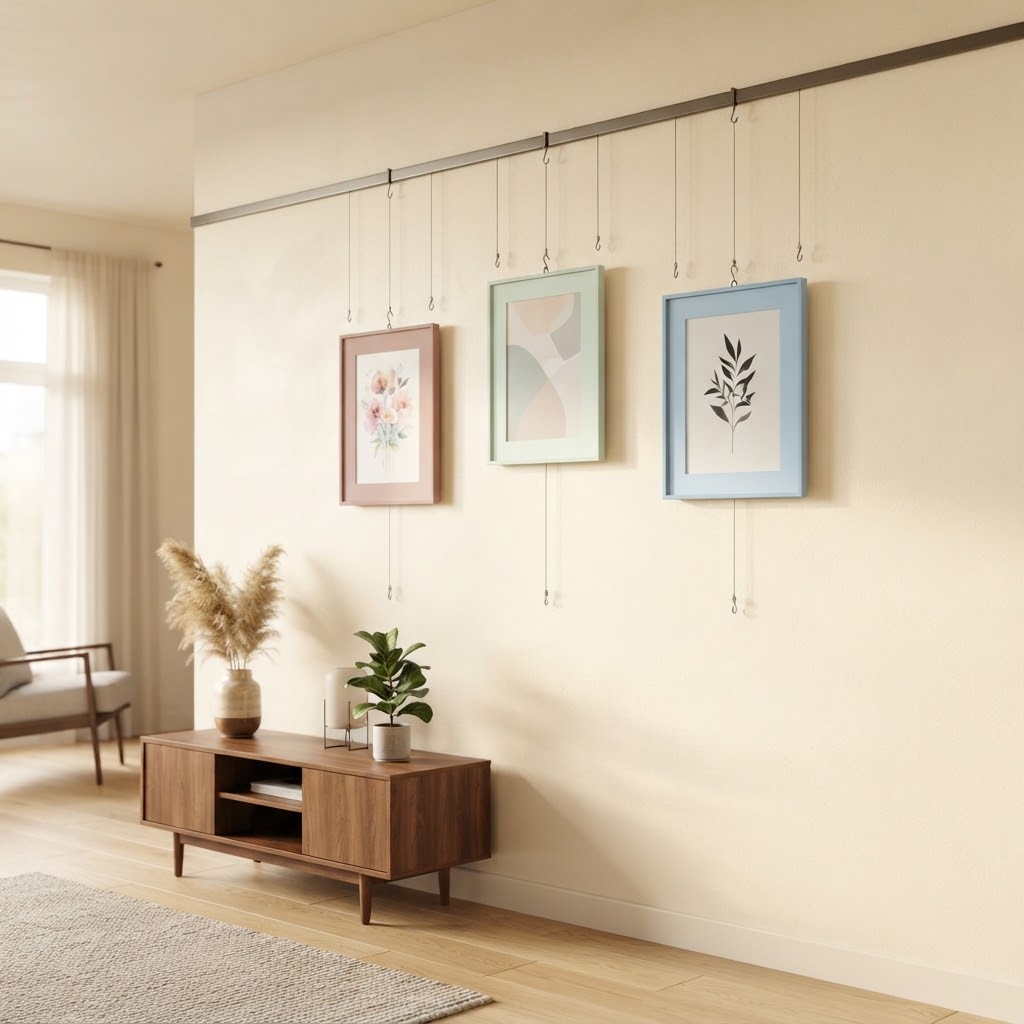
Skip nails and hooks entirely and hang your frames from a wall-mounted picture rail with hanging cords instead, letting each frame dangle slightly rather than sitting flush against the wall. The visible cords add an architectural, almost gallery-museum feel that a flush-mounted wall can’t replicate, and it makes rearranging the layout later completely painless since nothing needs to be re-nailed into the wall.
10. The Window-Grid Illusion Wall
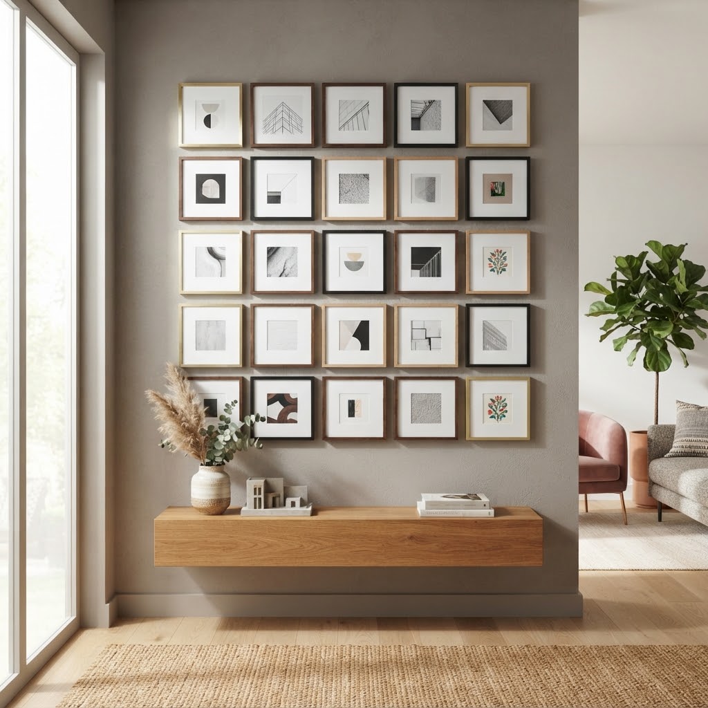
Arrange a set of matching square picture frames in a tight, evenly spaced grid, mimicking the look of an actual window with individual panes. This works especially well on an interior wall with no natural windows, since it tricks the eye into reading the wall as more architectural than decorative. It’s one of the more clever pieces of modern gallery wall ideas because the final effect looks nothing like a “gallery wall” at first glance — it looks like the room was built that way.
11. The Shadow Box Object Wall
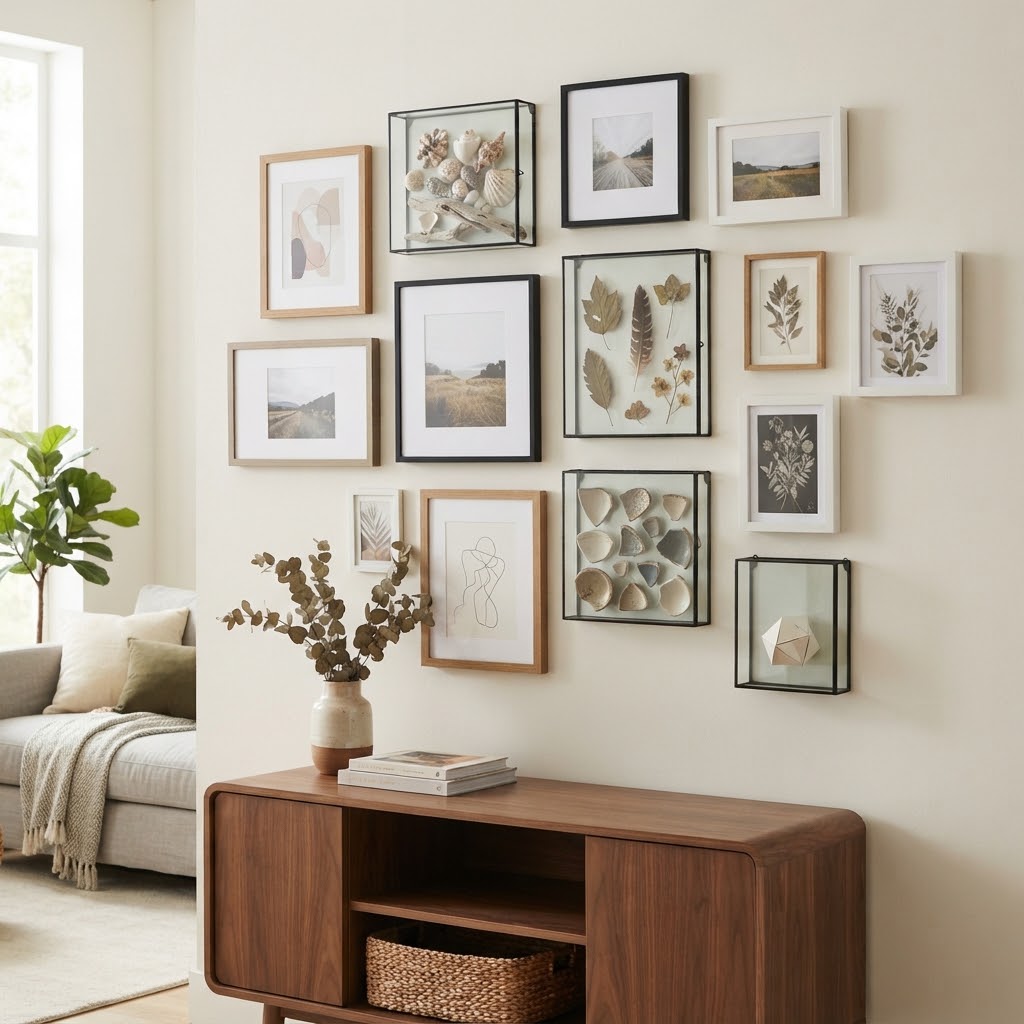
Instead of filling every frame with a flat print or photo, use a few glass shadow box frames to display small three-dimensional objects — a pressed flower, a small trinket, a piece of jewelry with meaning behind it. Mixed in with your regular flat frames, the shadow boxes add real depth and a personal story that a wall of purely printed art can never quite match, no matter how nice the prints themselves are.
12. The Color-Drenched Tonal Wall
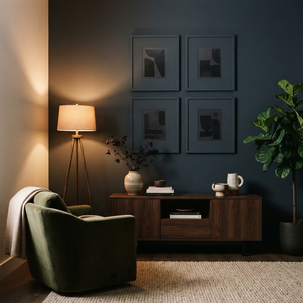
Paint the wall itself in a deep, saturated color, then choose frames in that exact same tone or paint your frames so they nearly disappear into the background, letting only the art inside each frame stand out sharply. A set of matching colored picture frames ordered to match your paint color is really all this idea needs, and the effect reads as far more expensive and considered than a standard white-wall, black-frame gallery ever does.
13. The Asymmetrical Cluster Wall
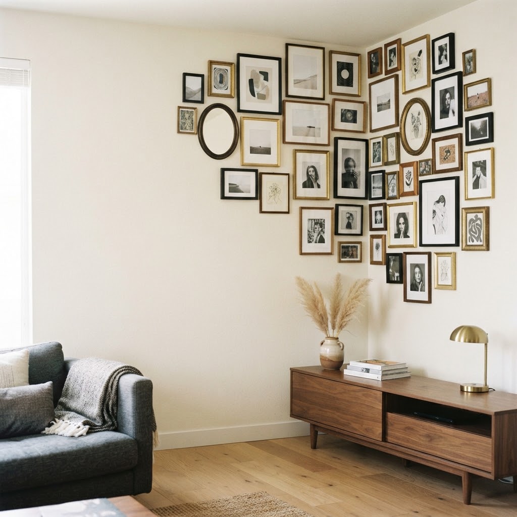
Instead of any grid at all, cluster frames tightly together in one corner of the wall in a deliberately uneven, asymmetrical pile, leaving the rest of the wall completely bare. A mix of assorted picture frame sizes works best here, since the whole point is contrast between the dense cluster and the empty space surrounding it. This is one of the boldest layouts on the entire list, and it’s the one most likely to actually get noticed the second someone walks into the room, purely because it looks nothing like the evenly spaced grid everyone expects.
None of these ideas need a professional installer or anything difficult to track down — every product mentioned above ships from Amazon and shows up in a day or two. What actually separates a forgettable gallery wall from one people remember usually comes down to breaking just one expected rule, whether that’s the spacing, the shape of the pieces, the height, or the material itself. Pick the idea that feels the most unlike anything currently on your wall, not the safest one, since the safest option is exactly what everyone else already has. A wall built around one clear, slightly unexpected idea will always outlast a wall assembled from a dozen small, cautious decisions. Start with one of these thirteen, and let the rest of the room catch up to it.
FAQ
How many frames do I need for a proper gallery wall?
There’s no fixed number — some of the boldest layouts on this list use as few as four or five pieces, while others use a dozen or more. What matters more than the count is whether the layout has a clear idea behind it, rather than just filling space.
Do all the frames on a gallery wall need to match?
No, and in most cases mismatched frames look more intentional than a perfectly matched set, especially when they’re unified by a shared color, material, or theme rather than being identical.
What’s the biggest mistake people make with gallery wall design?
Spacing everything too evenly and too safely, which is exactly what makes most gallery walls forgettable. Leaning into asymmetry, unexpected materials, or an unusual layout almost always creates more visual interest than a strict grid.
Can I build one of these gallery wall ideas without drilling holes in the wall?
Yes — picture rail systems with hanging cords, adhesive-backed frame hooks, and leaning pieces against floating shelves are all renter-friendly options from several ideas on this list.